


Signboard Design - Font Size
Failure to provide the right text size could make your signboard not readable from a certain distance. You will need to consider to choose the accurate font size for the specified distance. First, you will need to do some analysis on how far you are expecting your customer to see your signboard. If your shop facing another building means you shouldn’t put really big letters as this only can be viewable from a shorter distance. If your signboard facing roadside means that you will need to consider using a bigger size of the font size. Choose the right font size for effective targeting.
Font & Background Color
It’s important to consider which colour text and background to choose while designing. Ultimately the intention to make sure the message can be observed. How effectively the colour can be chosen? The key is contrast. Contrast means the difference in brightness between the light and dark areas present in a single design.
A bright yellow background, for example, will contrast well with dark letters such as black, a dark shade of blue and even purple. The greater the contrast or difference between the light and the dark colours, the more legible text is from a distance.
The above 15 colour combinations for lettering were tested for readability at a distance by the Outdoor Advertising Association of Malaysia. The results ranked in the sequence shown, with #1 the most legible and #15 as the least legible.
Take a look at the illustration above. Which of the two looks larger...the white letter? They are both the same size. The use of a light coloured letter against a dark background makes it seem larger. Light letters tend to come at you, whereas dark colours tend to recede.
As a rule, white as the background colour is by far the most versatile because more colours naturally contrast better against a neutral white background than any other single colour.
When you decide a background colour for a custom sign other than white, you limit your selection for colours that will both stand out and "go with" that background colour. That's not a good thing or a bad thing - it's just something to keep in mind when making colour selections.
Signboard Design - Font type
Font type or typeface is another important factor that you should take into the account. Choosing the right font type is critical for your business type.
There is 2 type of business type fonts.
- Formal
- Informal
Some fonts can manage to be both formal and casual, depending on how they are used. And there are degrees of both formality and informality.
It's just a matter of deciding a font that's best for your particular message and organization. Here's a scenario:-
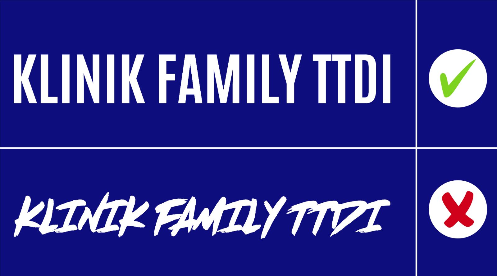
If you were opening a clinic you might design something like this:
Customer usually will choose to go to the clinic which has the formal text than the informal text. See how simple mistake could cause a big issue! Another important thing to consider is not to select font type which hardly readable Using all capital letters could make the content is difficult to read.
Signboard Design - Do Not Try to Utilize All The Space Available
Now the space that you have for your signboard. You might be thinking to utilize all the space available since you are paying for it. Wait! You are wrong. Adding more content just to fill all the space is the wrong decision. Some people add their products and more images in their shop lot signboard. It makes the signboard more congested and it make your company image ugly and also hard to read as they are too many words.
Imagine a motorist pass by your shop and he only has a few seconds only to read the content. If you have a lot of text and it looks congested then how you can expect that he can read the key point and understand about your business?
It’s vital to consider the content while design. Try not to add all your products but only your business name and also the type of business is sufficient. This can make easier people understand about your business nature which you will get more conversion.
Don’t Worry, if you have a problem designing your signage or signboard Bumi Jaya Advertising will help you! We have many years of experience designing signboard and we know what is right or wrong! Don’t wait, contact us now! Check out our promotion on free design.